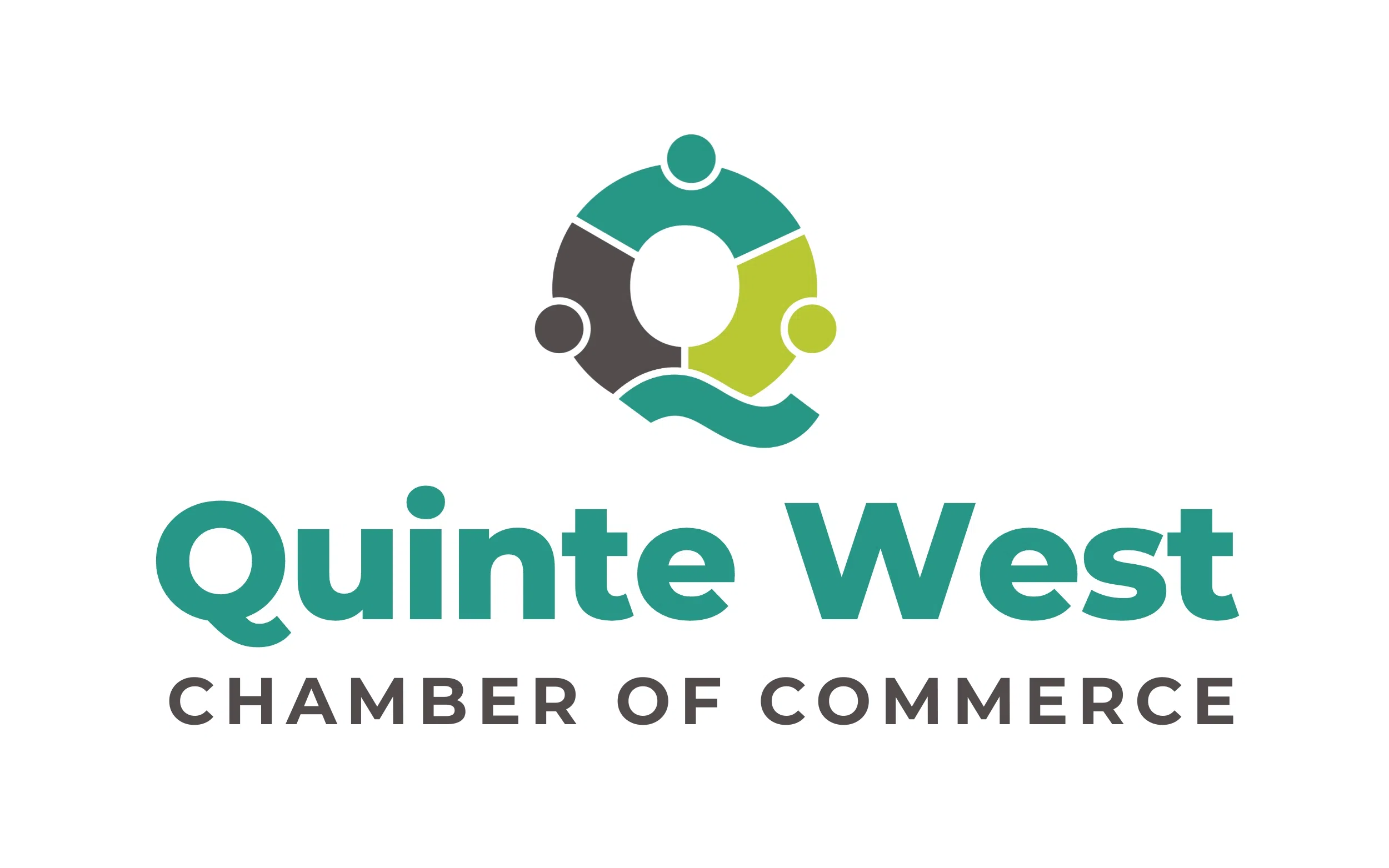
The Quinte West Chamber of Commerce revealed its new brand identity in an event Thursday.
CEO Suzanne Andrews says the new branding symbolizes the Chamber’s continued dedication to the region’s diverse business community and its commitment to promoting growth, connection, and advocacy for local businesses.
Andrews emphasizes that the refreshed brand visually communicates the Chamber’s strong foundation, which is built on collaboration, community roots, and forward-thinking leadership. “As Quinte West has grown and evolved, so have the businesses that power our local economy,” says Andrews, “This rebranding reflects our commitment to represent our mission to support a thriving business community while keeping our core values at the heart of everything we do.”
The new logo is a clean and modern design that represents the Chamber’s purpose and the Quinte West community.
The logo’s four interconnected puzzle pieces hold symbolic meaning:
- Top Puzzle Piece – Symbolizes the chamber itself, dedicated to serving and supporting the region’s businesses.
- Right Puzzle Piece – Represents the Quinte West business community.
- Left Puzzle Piece – Reflects the Chamber’s connection with government at all levels.
- Bottom Wave Piece – Nods to the Trent River and the Chamber’s deep local roots.
A Brand Refresh Committee helped design the chamber’s new logo. Members included Brent Parsons, Bev Woods, Jeff McKerracher, Katie Sherratt, Nikki Meiboom, and Jenny Chandler, as well as Chamber staff members Jennifer Snider and Emma Crowley.
The Chamber also partnered with Simple Desk, where Jenny and Maddie guided the design process, resulting in an identity that reflects the Chamber’s longstanding values and ambitious outlook.


